  The reason I see that both of these students won the NYT 2022 coming of age is because of the fine art that they both show as well as the clear message of each art piece. The work from the left shows a representation of "loneliness" or being in "isolation" which I think a lot of people in our generation, including myself, can relate to. The way that it was drawn out by Carmen shows how well this fine art is because without the explanation I feel like I would have been able to understand it well. The piece from the right also shows the problems of the misinformation that was thrown at us during the pandemic. It shows the coming of age because a lot of us spent our "prime" teenager years being on lockdown and having to be isolated or masked up. I think Jenny represented the situation of the pandemic and the use of media combined really well.
0 Comments
 I think this post that I have is something that could be improved from the quality of the picture. Although the picture is focused on the succulent since I used the ruled of thirds for it to be at the center, I think if I would have increased the exposure from the bottom of the picture it would have been better. Especially if I had done that and taken the picture with portrait mode that way the succulent would still have the same focus and the exposure could go up without problems of a drift of focus. Although the picture looks like it's taken in portrait mode it wasn't which taking it in that mode would make it better as well. The caption is written in the good format with the title of the piece, the date, and the location of the picture followed by the picture credit.
  I think the pictures from my instagram have similar concepts in the way the sky is as the sun is setting and there are different materials in front of the sky in the forefront. The composition for the picture on the left is not as good as the picture to the right because of the hand that is placed in the bottom left while in the picture to the right there is something in the forefront to the sunset, however I think the gate helps the picture because it's consecutive.
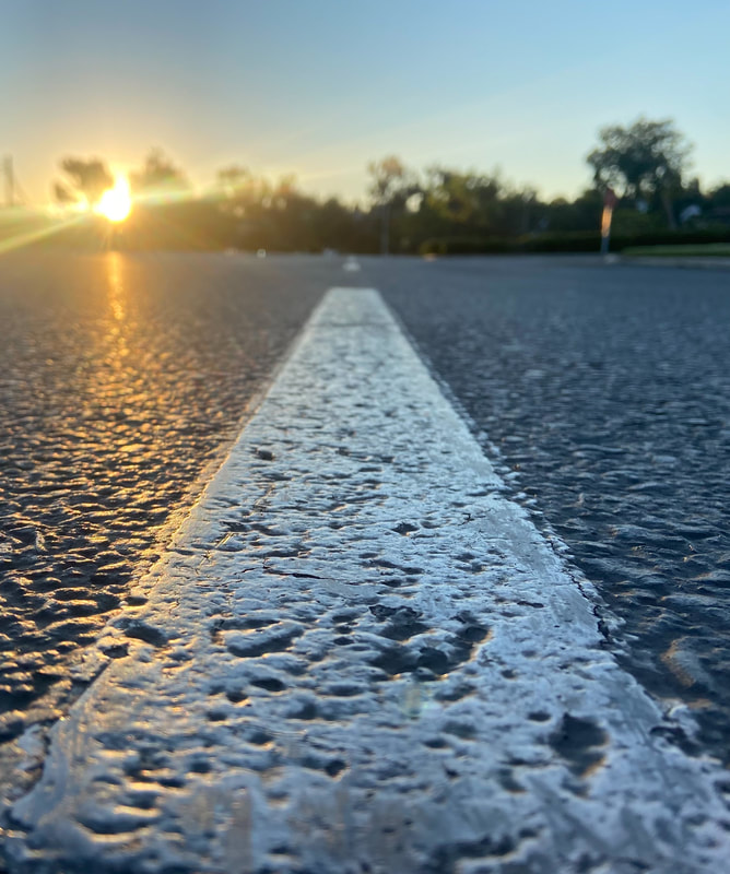
I think the composition of both photos is similar in the sense that there is foreshortening and in the background there is something that also adds element to the pictures In Julianna Sortillon's picture to the left she has a book or newspaper in front of the camera lens and since it's rolled up, at the end of the picture in the background is someone looking through. In my picture to the right there is foreshortening with the street line being in the foreground while the background to the left is the sun rising. The lighting of the pictures is also set up to show fine art. In Sortillon's picture there is pop color while in my picture there is light from the sun coming through the front left side.
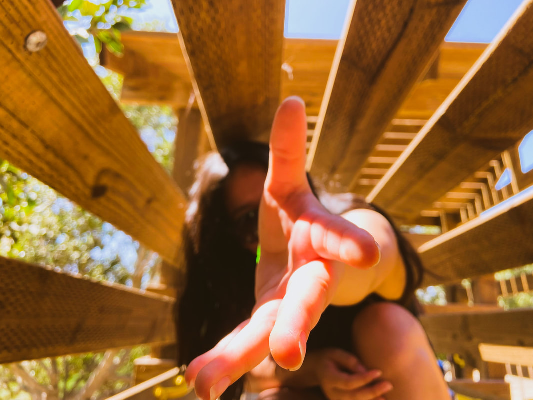
The photo to the left is what Silvio Guzman had turned in to the ATPI Fall contest and what made it a winner. Her photo shows three- fourths lighting because of the light coming in through the window which we can assume is on her left side with the blinds in front of the window given the shadow shape on her face and in the background on the wall. The forefront is whatever piece of furniture is in front of her which covers the rest of her body. On the right is my picture showing foreshortening with the hand placement. Both pictures coomposition are put in the way to make it work with the surrounding.
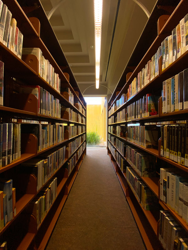
The left is the picture of Amina Bilalova who won The New York Times student competition. This art piece is a fine art of drawing with sketching and can also be identified as pop color. The pop of color comes from the red of the drawing showing the baby pieces while everything else is grey which is a regular person with school supplies. From this drawing alone we can infer that it could be trying to express how people who are in school often have other responsibilities such as taking care of a child. The contrast from my photo is higher than comparison because my photo shows shelves of library books. In my photo the composition and lighting is set up to show the whole books in this area while the lighting gives it a comfortable feel to it.
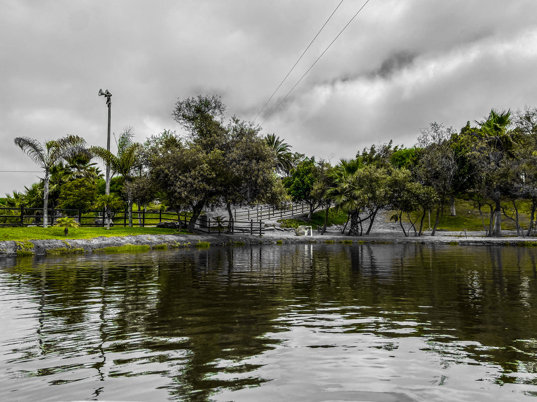
The two pictures show travel and place for the Texas Photographic Society ISC. To the left is Zachary Bashour's "Secluded Beauty" taken in Dallas Texas and to the right is my picture, "Green Life," taken in Ensenada, Mexico. Both picture are for the travel and place category of the contest and from both pictures we can see trees as well as water. While Zachary's picture shows the full color of the blue sea and greyscale sky, my photo only shows green as it is showing the art of pop of color. The composition of each photo is also different as we see that in mine the water is at the forefront while the trees are in the background. In Zachary's picture the single palm tree is in the forefront and the body of water as well as the mountain is in the background.
 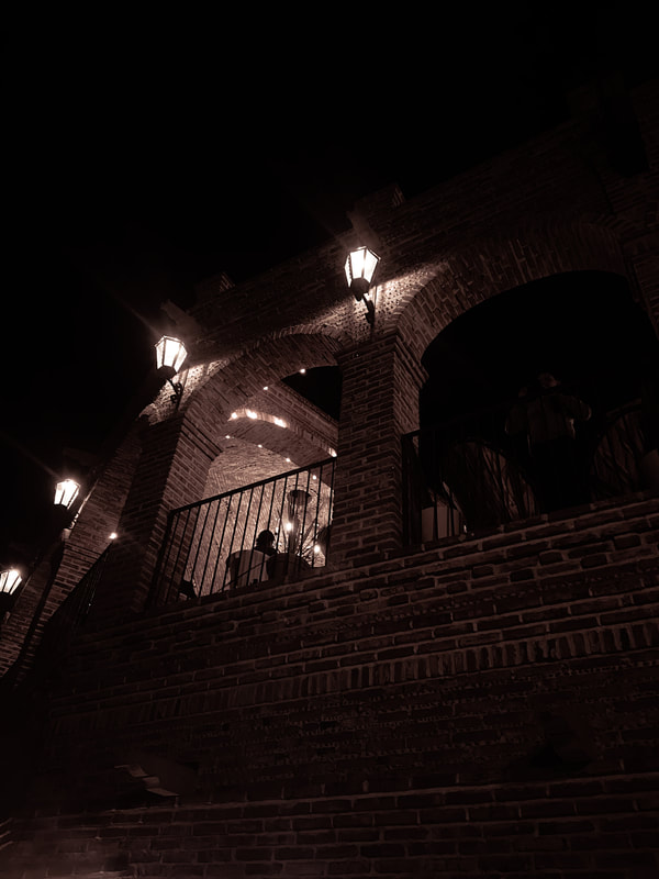 To the left of the blog there is the picture by Paul Valois which shows the fine art of architecture as well as life. The picture shows a forefront of a pillar with a background of another pillar with a man by the stairs. By the light from the background pillar and on the right corner we can conclude that the light is coming in from the right of the picture . The color of the picture shows warm colors as well as dark through the shadows.
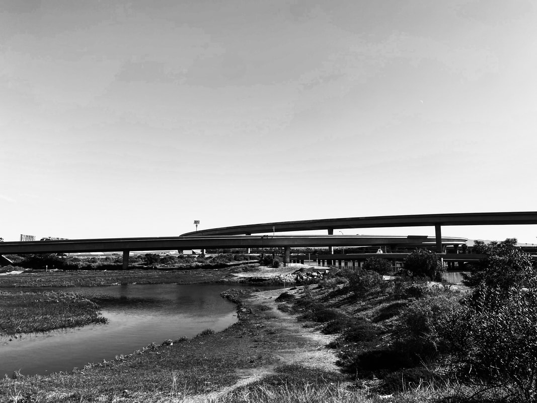
On the right is a picture I took at a restaurant in Baja California, Mexico. The picture, as Valois' picture shows a fine art pf architecture by having taken the picture of the building outside from a lower angle. Having taken the picture in this composition we can see the building from the bottom middle to top. The picture also has its warm color followed by the lighting from the lamp overhead. This lighting then casts the shadows which show a max of black around the building. On the left is a picture from Edward Weston showing landscape as well as black and grey photography. From the right is my picture that is also landscape and has been edited to be black and white. Both picture show the landscape of nature, in Weston's picture there are mountains and in my picture we have a bike trail with a river.
I think the contrast between them is how in Weston's picture it's at a leveled position so that the composition of the picture is at a good level. A for my picture, it was taken from a lower leveled composition because it's taken from my phone. Man Ray's picture from the right shows what we can see and two silhouettes kissing and there seems to be the effect of double exposure that also shows us two hands over each silhouettes' head. On the left is my picture taken from the floor of the room where I capture the cat on the windowsill laid in front of it which due to the lighting and the cats color makes it look like it's a shadow.
Most of Ray's work has to do with Surrealism which I think his picture, "The Kiss," depicts some of his work that he would do. In my picture there is more attribute to lighting and although its not black and white, there's a contrast from shadow and the lighting through the window. Something about both pictures that I think are similar is the idea of "life," because in my picture it shows the cat as well as a plant behind the cat and in Ray's picture he shows two people as what we can assume is their hands in the double exposure feature. |
PhotographerJasmine is a senior who does their best in photography. Archives
December 2022
Categories |
- Home
- About
-
GALLERY
- B&W Photography
- Creative Photography
- Double Exposure
- Elements of Art
- Event Photography
- Food Photography
- Forced Perspective
- Layout / Series
- Lighting >
- Motion /Action/ Sports
- Pop Color
- Photo Editing
- Portrait Photography
- Principle of Design
- Rule of Thirds
- Selected Works
- Sustained Investigation
- Videos
- Your Choice
- Finals 2022
- Blog Fall 2022
- BLOG SPRING 2023
-
Finals Spring 2023
- Bonita Museum 2023
- DOODLE4GOOGLE 2023
- Directing Change 2022
- SAE 2023
- RMSP 2023
- 9TH CCC 2023
- Arts Empowerment 2023
- US VS HATE SPR. 2023
- SA 2023
- BVHS ARTFEST 2023
- SW DMS 2023
- 420 REMIX 2023
- CAA Jacobs or Vargas 2023
- Groff 2023
- Karangalan 2023
- iVIE 2023
- MOPA 2023
- BVHS DMS 2023
- SDCFAIR 2023
- ATPI FALL CONTEST 2023


 RSS Feed
