|
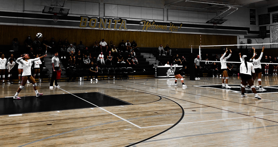
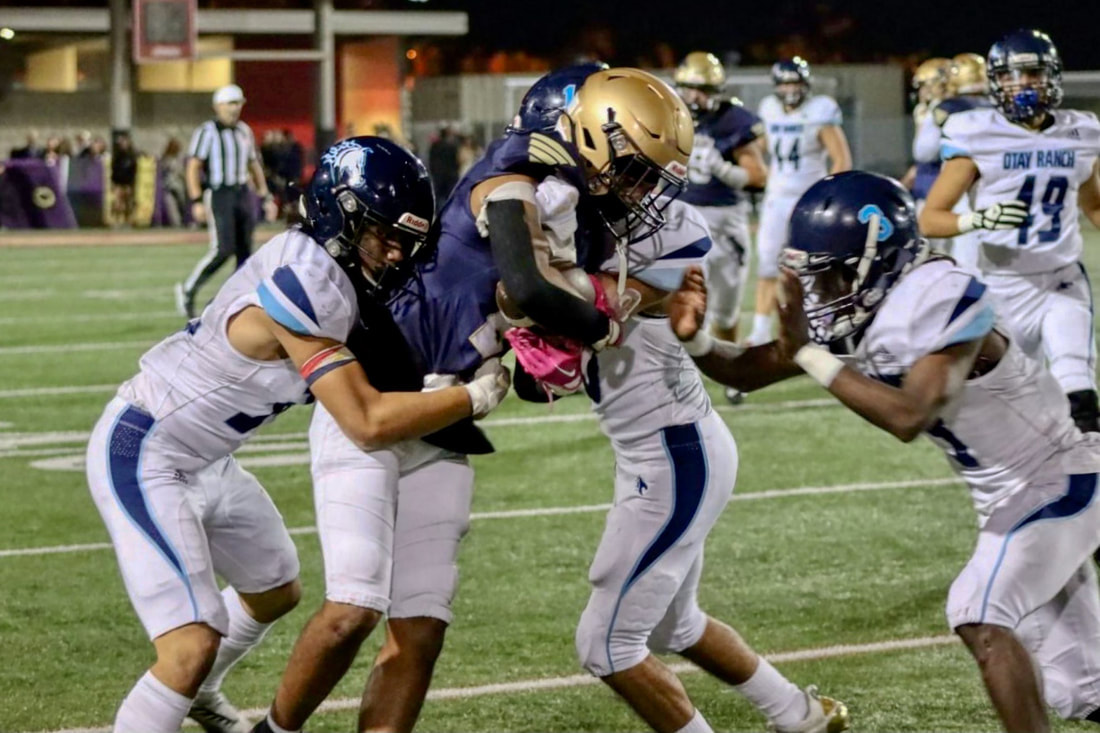
Compared to Tyler Scott's picture, my picture is more darker because I used the pop color of orange to make it more dramatic whereas Tyler's picture is full of high vibrant colors, Both of our pictures show that it was taken mid motion because of some of the blur and positions of the people. I think Tyler's picture best suits the category because it shows more colors in one place.
0 Comments
Leave a Reply. |
ArtistJasmine is an AP student photographer at BVHS. Archives
May 2023
Categories |
- Home
- About
-
GALLERY
- B&W Photography
- Creative Photography
- Double Exposure
- Elements of Art
- Event Photography
- Food Photography
- Forced Perspective
- Layout / Series
- Lighting >
- Motion /Action/ Sports
- Pop Color
- Photo Editing
- Portrait Photography
- Principle of Design
- Rule of Thirds
- Selected Works
- Sustained Investigation
- Videos
- Your Choice
- Finals 2022
- Blog Fall 2022
- BLOG SPRING 2023
-
Finals Spring 2023
- Bonita Museum 2023
- DOODLE4GOOGLE 2023
- Directing Change 2022
- SAE 2023
- RMSP 2023
- 9TH CCC 2023
- Arts Empowerment 2023
- US VS HATE SPR. 2023
- SA 2023
- BVHS ARTFEST 2023
- SW DMS 2023
- 420 REMIX 2023
- CAA Jacobs or Vargas 2023
- Groff 2023
- Karangalan 2023
- iVIE 2023
- MOPA 2023
- BVHS DMS 2023
- SDCFAIR 2023
- ATPI FALL CONTEST 2023
 RSS Feed
